
And another newie. I've been doing the posters for these MUM club nights in Auckland, but the first ones I did were going off the template the guys who run the Sydney nights created. I'm looking forward to doing more stuff for these guys though... posters every week, with fairly diverse headliners and the like. Should be a good challenge.
Monday, December 22, 2008
Saturday, December 20, 2008
Comeback Kid

This is kinda pretty different for me. Or at least I feel like it is. First time I've tried doing the 'picture of a chick' poster. This was at the promoters request pretty much, and I struggled with it for a while before I found my direction. I didn't agonise over the line work too much either and it worked out pretty well... doesn't look as loose as it is. Or something. Either way, I like this poster a lot. I like it more now than when I finished it a couple of nights ago too. I might rip the text off this and work on it a little more. Turn it into an art print. Could potentially be a good series. Give me an excuse to practice drawing faces anyway. I used photo references pretty heavily, but modified it all enough that hopefully no one sees themselves and gets offended. or stoked. haha. That just gave me an idea....
oh yeah, I own a couple of Brian Ewing's gig posters. His work definitely had an influence on this poster.
oh oh yeah, my camera was out of batteries on exhibition opening night so no photos I'm afraid. I'll take some photos when I go in next though. And anyone out of town who was interested in prints, hit me up. The opening was insane though! So many people. The free booze didn't last long at all, but people seemed to stick around for a while. It was a weird experience. I'm still processing it somewhat. I'll write more soon, and put up pics.
Friday, December 05, 2008
XmasX

It feels like forever since I did a poster. Been so mad with exhibition planning and the like that actual work has been sidelined a little.
Anyway, here's a poster for a Xmas show. I was a bit stuck on this one conceptually, then after thinking about the name Antagonist, the Grinch seemed perfect. So that's what I did.
This one's notable for being the first time I've probably intentionally infringed on someones copyright somewhat. By which I mean, done an interpretation of an established character. I've never felt comfortable with my drawing style (for what its worth) enough to attempt it... but, well... I guess I do now. feel comfortable enough to do it I mean. for a finished piece o' work.
I'm very tired. Was up late, then couldn't get to sleep for some stupid reason, and when I DID sleep, it was pretty uneven. I'm sposed to be called up for a radio interview about my exhib, but they're 20 mins late so far. How wude! I imagine I'd be fairly low priority though.
Speaking of radio interviews, I'll be live on air at Radioactive on Tues night, and on VBC on Weds night. A regular man about town I am.
Thursday, November 27, 2008
yo dawg, it's X to the E Exhibition

Funny how slow I am in posting this on my blog, it's already most other places. I doubt anyone who follows this blog at all doesn't even know about this exhibition yet (hey, leave a comment and let me know if that's not the case! I'd be interested to know), but yes, finally after years of doing this stuff in near anonymity, I've decided it's time to get fuckin famous. Or at least, see all these posters up in one place at the same time in lovely frames. I hadn't actually considered that fact until someone pointed it out themselves... I've never seen all these things in one place at the same time. Or framed. or A2 sized. I'm pretty excited about it. I've seen a bunch of the final prints (some of 'em needed the colours fixed cuz I made a hash of it) but I didn't really stand and look at 'em properly, Sam Broad and I were picking the mouldings for the frames and concentrating on that more. Suffice to say, I'm really really excited. And nervous. Oh so very nervous. This is kind of the culmination of years of working hard as hell on what basically amounts to advertising with some of the shortest life spans ever. Although, apparently not so short after all.
Anyway, prints will be available for sale ($50), as well as the framed posters($ican'tremember.rightnow). Very limited editions (15-30 max, depending on the print and how much I underestimate how many people would want it). I honestly have no idea whether I'll sell a few, none or the whole lot. My certainty of any outcome changes constantly all day. Oh the stress!
Speaking of stress... this is the most organised I've been in a long time. It's been the kick up the bum I've needed, and it's pretty sweet. I have Jacki Condra at Rex Royale to thank for that. Years back she sold some of my skullbomb t-shirts through her store. Recently she realised I was the guy making all the posters and asked if I'd be interested in doing a show. It took me a little bit to set a date and lock it all down, due to being a bit of a pussy, but I did it. We set the date for Dec 4. That eventually got pushed back. Again, partly because of being a pussy, but also cuz I realised I'd need more time to promo (and try and score free booze for the opening. Who goes to dry art openings? no one. Hell, if there's no booze at mine, I'M not showing up). Anyway, yeah, I've always been pretty averse to self-promo and all that kinda stuff for whatever reason. I just wasn't comfortable with it... but I've realised I've done enough work now, that I'm very proud of (goeth before the fall? ruh-roh!) and I'll stand by it while people in a crowded room drinking free piss criticise it. So... I guess I'm comfortable with that now? We'll see.
Skip to the end. I'm having an exhibition. Go to it. Buy some prints. Hi Kylee.
one last thing: I just saw my flyer, and then a picture of Kanye West. I wondered "does the title of my show make me sound like an arrogant self aggrandizing dickhole?". I decided "No, of course no one will think that". Quickly followed by "Well they will now, stop writing!".
Wednesday, October 29, 2008
So SOOO Modern

Logos! Yay! No offense (okay some) to sponsors, but you do realise no one even looks at your logos on poster besides other sponsors and promoters (who just wanna see who they can scam free stuff off). Mostly your logos just ruin posters. Orrrrr maybe I should just be less shit and get better at incorporating them into my designs.... or do what a lot of folks do and just slap them on really blatantly at the end in a white box so that the logos stand out so badly you know whoever added them hated them even more than I do.
Sunday, October 26, 2008
!!! WIP

I should probably add sketch scans to this one. but i'm tired so I'll sort those out later. hurrah!
Thursday, October 23, 2008
Sora Shima Update

This was a really gruelling project, and took a long long time. Far longer than I care to even estimate. I spent forever trying to get the band name looking right, with a mix of organic vineyness and illegible legibility. I haven't spent any time drawing logos for Black Metal Bands so it didn't come naturally. Anyway this project evolved a lot, from the inital style (I like frame 2 a lot) to where it wound up, which was somewhere far more intense than I'd originally planned, but ultimately more how it should've gone from the start.
anyway, here's a bunch of incremental saves through out the process of designing this album cover. I sometimes run into problems with clients seeing work in progress pics and not being overly happy. I'll readily admit that a lot of my stuff looks pretty ratshit til about the 75% completion, which is where all the detail and polishing goes in (see also Holy Fuck poster.. .same deal). The last 25% is time consuming as hell, but I have to do it to make myself happy ultimately.
![]()
I think I'll post up some more of these process gifs (if only to make myself realise how massively inefficient my workflow can be. This was definitely an extreme case though.) I tend to save incremental work files fairly frequently as I tend to make it up as I go along a bit, outside of having a general overall vision of how things are going. Depends on how paranoid I am about losing some sort of mid-project genius but overworking it and being able to dig it up again without too much trouble. I now realise that I have almost never gone back to an older file and they're just eating up harddisk space. I guess it's the hoarder in me.
Monday, October 13, 2008
Of Montreal flyer

as far as poster goes, this isn't 100% complete as far as I'm concerned but the promoter needed a flyer to hand out at upcoming gigs. But I'll chuck it up anyway so friends of mine can have a looksee. Hi guys!
Sunday, October 05, 2008
Cut Off Your Hands

This has more in common with posters I was making a couple of years ago, and less of an illustrationfest than recent things. Was a nice break. This had more hand-done text but it started to look a little bit too over the top... to my eyes, it's got a bit of a movie poster vibe to it with that text.
Monday, September 29, 2008
Jeremy Jay

this poster is notable for being pretty much the first time I've drawn a 'real' person in a poster or final piece of work.
it's also notable for being pretty choice. haha
Tuesday, September 23, 2008
HOLY FUCK

Pretty different from the usual stuff.. just trying out some things. I contemplated attempting to do this pixel-art styles. I'm kinda glad I didn't, as it would've taken roughly a million years. give or take.
more posters in the works at the mo.. check back in a couple of days.
Friday, September 19, 2008

Friday, September 05, 2008
Yeasayer

There's an earlier alternate version of this. But then I had a sleep and decided it wasn't finished. But the other one was out in the wild for a while there. I'll post up a small process thread for this if anyone's interested. as a side note, drawing hands is HARD. They took forrrrever to get right.. and they're still not awesome.
Thursday, August 28, 2008
freeview
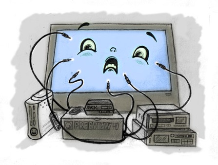
Magazine article illustration.
Was good to have a finished drawing. I changed the position of the face and coloured it in Photoshop, but other than that, that's the pencils. I am sleepy.
I've drawn quite a few things with flowy tentacles or lines... or it feels like I have. the FTS ep cover... umm.... oh, the Kristen Hersh poster.... whatever, time for sleep.
Monday, August 25, 2008
Groove Guide cover

hurrah.
credit to Lydia for the suggestion of the speech bubble. I'd claim it as my own cuz it amuses me no end, but no, that's not how I roll. kudos Lydia.
Monday, August 11, 2008
I'm just as confused as I am

It's a while since I've straight up drawn a poster. I mean, it was inked digitally and changed quite a bit once that was done, but I had it somewhat figured out on paper. Just for giggles, here's the initial sketch. I very rarely draw things that big... generally my sketchbook pages are crammed with tiny drawings. To illustrate my point (hurhur), look to the right of the picture on the left


I've been trying to draw more human characters lately.. or at least things with two eyes. I was drawing cyclops characters for a long time cuz I had trouble getting 'real' faces looking right. Felt like it was time to try and, I dunno.. improve? I feel like it's working thus far.
While I was working on this poster I had in mind that it was kinda like a companion piece to my first poster. As is my way, I didn't look at it for reference at all. I tend to work off how I remember things in my head rather than look at references as I tend to wind up getting way too particular. And things come out a little less derivative if I do things that way. Anyway, I looked at the first poster now and they're similar only a really base level. Anyway.. here's that poster for your old timey poster eyeballs

Monday, August 04, 2008

Monday, July 28, 2008
something by someone else
I was poking about Drawn.ca last night and came across this post about artist Leesa Leva's new prints. the photo on the blog intrigued me so I did the usual internet thing and meandered my way to success. Success being spending money I probably shouldn't. But I spent it on this really impressive piece of work.

Now I'm not normally a big fan of the whole pictures-of-girls thing. You know what I mean, right? Hell, this piece features a few things I'm kind of sick of seeing... ornate wallpaper textures, really vibrant gradients... okay that many things. .. basically I'm just not that into stuff that's just a basically drawing of some girl. And it's not because I think they look shitty or anything, most of the artists doing 'em make really nice stuff, but it's never really spoken to me. But this one did. Exactly what it said, I'm unsure. "Buy me" probably. Whatever, it clicked with me. Got the same thing from other work on her site... I might not know exactly what the pictures are about but I can tell there's more depth to it than just "ooh pretty".
Anyway, I love this. A lot! The linework around her face reminds me of James Jeans work a little, and that hair is fantastic! But it just looks so complete, and has an iconic feel to it. I'm excited about acquiring it.
The other weird thing (I guess) is I don't even think the girl in the picture is hot haha.. pretty much the polar opposite of my "type". Perhaps I'm missing the point of pictures-of-girls.
Actually, it looks a bit like Jemina the singer from kickass band, Be Your Own Pet.
Saturday, July 19, 2008
Brian Jonestown Massacre tour poster

Tour poster. something a bit different again. Tried to mix psychedelic with my own style (whatever that is) into something vaguely movie poster-ish,
I think a fair bit of my near-obsessive love for The Venture Bros. found its way in there too. Season 3 is absolutely ridiculous so far. So good. Although for some reason no matter how often I recommend this show to people never seem to bother to check it out. Their loss I spose.
Monday, July 14, 2008
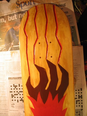
sk8b0r3d
I was (not so recently) invited to be part of an exhibition being put together by the COCA gallery in Christchurch. An exhibition of skateboard decks all prettied up. And they'd send me a deck to ruin. Given I'm pretty intimidated by painting (or anything artwork related that lacks a Ctrl+Z) it took a while to suss out what and how I was gonna do this project. Got there in the end. lots of layers of paint, sanding and varnish. And woodworking. I hadn't done anything with woodworking tools since I was like fuckin 12. Somehow I managed to not make a complete hash of it. There's a few issues I have with the piece, but nothing major enough for me to feel apprehensive about it going in the show haha.
without further a blabber, here is the deck, titled.... uh.. I'll get back to you on that one. No wait, Monstroso! it's called Monstroso.


Monday, June 16, 2008
some day job stuff

Here's some things I drew today. I'm a little surprised at them myself. They're a wee bit cutesy generic, but... I guess this is the first time I've really done things like this.... I mean, I draw a lot of cutesy shit, but usually just on paper. The main thing that surprised me was the shocking realisation that the buhjillion hours I spent on the !!! poster and the robot illustrations actually translated into increased skills. I believe people who play World of Warcraft refer to that as 'grinding'. Never played it myself, never plan to. Maybe World of World of Warcraft though. For now, I'm too busy drawing. Or watching the Venture Brothers endlessly.
Thursday, June 12, 2008
BJM Flyer

Promoter wanted something to hand out at some local shows. The real poster still in progress
Monday, June 09, 2008
Robits.


Slightly sleep dep'd but I was determined to get these done and dusted today. Two full page illustrations for a magazine. I got suuuuuuuuper pedantic with these given the size they'll be vs distance they'll be viewed at.
all created in flash. I made some sweetass gradients. I might post a process thread of these images.. the evolved a lot over time.
Tuesday, May 06, 2008
(y)our band is over

 Two sweet bands, two final shows, two posters. I'm really glad we got to play with the Insurgents before they (and we) broke up.
 Ideally the poster for our final show shoulda been more upbeat or just generally not so grim, but nothing was really working for me, and thus, that cheery image. I always struggle with designing stuff for FTS for some reason. Too close to it I guess. I didn't feel like expressly stating "FINAL SHOW" or words to that effect on the poster, but I'm assuming people will be able to get the general gist from the imagery at hand.
The guy in the Insurgents poster looks oddly familiar, no? I hate text. As I'm starting to enjoy drawing more and more, it seems directly proportional to how much I hate laying out text. Or at least doing posters that require a ton of text. Grr. GRR!
Saturday, May 03, 2008
scribbledygook
Today someone said "draw me a monster". so I did. and I liked it. Then someone else wanted one. Did one for them too, but didn't like it as much. Then the first person asked for another one later in the day. Since I've basically been procrastinating, I did another. It was better than the second one, but not as good as the first.
Anyway, they're below in chronological order. They were done fairly quickly... 10-20 mins~ roughly... which is real quick for me! I'm going to try and get into the habit of doing this regularly, as a means of playing around with drawing and just to generally sharpen up. They're all done in flash. and I'd just like to say that I dig the legs on the first one.


Thursday, April 17, 2008
dear blog, sorry about the neglect. here's some pictures of recent things.

This poster was a huge amount of work (that I made for myself really... no one asked me to be a tard and do multiple allnighters on it), but at least it kinda shows. Click on the pic to see it bigger. There's a lot of stuff going on in there. Some narrative too, but odds on you'll only pick up on it if you're massively sleep deprived. I hate logos.

Album cover for Flip Grater. Stack o' cups. Stacks! This one was a bit of a mission... part of the reason I haven't updated lately is because my personal life went to hell, taking all my creative drive along with it. I struggled for ages to even come up with a concept for this cover... actually I had an initial concept that'll find a new life in another form, but yeah. It got done in the end.

This was designed for a one-off LP cover for a compilation put together by Mr Jonathan Bree of The Brunettes. Sadly copyright and vinyl press issues seem to have killed the whole deal for the time being. I'm considering dropping the text off and just doing an art print. Any takers?

In Fighting the Shakes related news, we've been chosen to open for Against Me! at their Wellington show on May 6. New Wave was one of my favourite albums of 07 so I'm really stoked about it! We're also opening for the Mint Chicks at their next welly show on May 9th.
We shot a video for Your Life Is Over last weekend, which I've just begun to edit. No idea how it's gonna come together, but something'll go up on here when it's done.
and finally, we're breaking up at the end of May.
should have some more new stuff to lay on you in the next couple of weeks!
Sunday, January 27, 2008
dang!
A blog called You the Designer recently made a post titled '16 Sensational Poster Designs'. I was pretty amazed to see the recent poster I did for The National in there. Like really really pretty amazed. What's funny/sad is the poster wasn't used very extensively to promote the gig at all. But hey, now shitloads of people have gotten to see it.
so yeah, that's news.
so yeah, that's news.
Monday, January 14, 2008
Half-Handed Cloud

Poster for a show that's pretty soon. This one was also pretty much all done in Flash, bar a couple of modifications at the end in photoshop.
This was sposed to just be a quick and dirty one, but I'm beginning to realise any time I agree to do a poster I can't bring myself to kinda phone it in. Orrr I go and do timeconsuming things like adjust all the types layout by hand to make it appear more random, less rigid.
Also, part of this poster is in part a tip of the hat to Little Friends of Printmaking... not that they'll care, but they're a huge inspiration to me, and I do my best not to rip 'em off where possible. I haven't seen anything new from them for a little while, but I think they transitioned from the gigposter pasture to the far more fertile land of uh.. doing something you'll actually get paid well for.
Anyway, I started this around midnight and finished at about 6:30-7 this morning. I should prrrobably go to bed.
Friday, January 11, 2008

Thursday, January 03, 2008
bang!bang!aids!


click for embiggened versions. although there's still more detail you might not really see on that version. I like this umm... AIDS gun? Whatever it is. This was all created in Flash. It's also motivated me to get hold of a Wacom Cintiq 12WX... as much as I like drawing into the comp with my tablet, I have trouble with the whole look one place, draw another thing... stuff takes me far longer than it really should, and I think one of those new tablets would increase my productivity greatly. Will find out as soon as I can source one in NZ, or sort out how to ship one from the US. glee!
Subscribe to:
Posts (Atom)