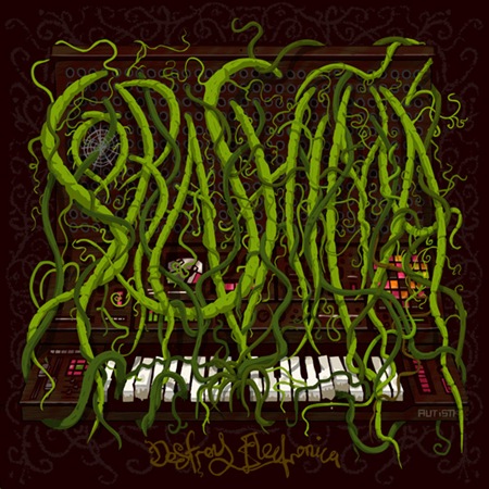
This was a really gruelling project, and took a long long time. Far longer than I care to even estimate. I spent forever trying to get the band name looking right, with a mix of organic vineyness and illegible legibility. I haven't spent any time drawing logos for Black Metal Bands so it didn't come naturally. Anyway this project evolved a lot, from the inital style (I like frame 2 a lot) to where it wound up, which was somewhere far more intense than I'd originally planned, but ultimately more how it should've gone from the start.
anyway, here's a bunch of incremental saves through out the process of designing this album cover. I sometimes run into problems with clients seeing work in progress pics and not being overly happy. I'll readily admit that a lot of my stuff looks pretty ratshit til about the 75% completion, which is where all the detail and polishing goes in (see also Holy Fuck poster.. .same deal). The last 25% is time consuming as hell, but I have to do it to make myself happy ultimately.

I think I'll post up some more of these process gifs (if only to make myself realise how massively inefficient my workflow can be. This was definitely an extreme case though.) I tend to save incremental work files fairly frequently as I tend to make it up as I go along a bit, outside of having a general overall vision of how things are going. Depends on how paranoid I am about losing some sort of mid-project genius but overworking it and being able to dig it up again without too much trouble. I now realise that I have almost never gone back to an older file and they're just eating up harddisk space. I guess it's the hoarder in me.


