 These guys are rad. I still can't get over the fact I'm getting to do posters for these bands, much less the fact that they're all actually coming to New Zealand! doubleyew tee eff as.
Thursday, December 20, 2007
theNational
These guys are rad. I still can't get over the fact I'm getting to do posters for these bands, much less the fact that they're all actually coming to New Zealand! doubleyew tee eff as.
Sunday, December 09, 2007
Monday, December 03, 2007
Anthems for a Twenty-Seven Year Old Boy

Quick (by my standards anyway) flyer for the upcoming BSS gig. I'm really excited about this! I have a pretty intense poster in the works for this. I love BSS so I'm very very stoked to get to do a poster for them. So I'm doin' it up right.
In other news, I'm teetering on the brink of complete burnout. I've been so busy lately with contracting as well as all the other jobs I commit to that I've had bugger all downtime. Combine that with the usual energy draining relationship issues (or lack thereof) and everything else and yeah... feeling pretty run down and looking forward to having some time to chill out, sit in the sun drinking beer, sit inside all sunburnt due to prior outside sittage, play video games and generally just take it easy. Oh, and screenprint. A lot!
In other other news, I bought a MicroKorg synth yesterday. It's fun. bleepybloop. Not sure if it'll weasel its way into Fighting the Shakes in some capacity, but I wouldn't rule it out. Our new songs are sounding super super promising and awesome by the way. Very poppy (by our standards anyway)!
Okay, back to the grind.
Sunday, November 25, 2007
All of a sudden I miss my weekend

This ended up pretty different from what I had originally planned. The text style and things are the same but the eventual execution is significantly different. Anyway, I'm pretty stoked on this. I resisted the urge to do any kind of distressing. I plan on screenprinting a small run of these A2 on black card (minus the bloodly logos, bane of the poster maker).
Been so ridiculously busy that the only way I could get this stuff done was to forgoe much of a weekend. And I have new 360 games that demand to be played! Life's tough. Although at the moment all the contracting work should see me pretty well secure, financially, over the summer, which is inevitably dead as a doornail work wise... still about late Jan.
Friday, November 23, 2007

Your Band's Poster Rocks
November 22 - December 10th
Opening Night: Thursday November 22nd 6pm
Up There Arts Gallery Space
145 Karangahape, Newton, Auckland
"Your Band's Poster Rocks!" a cry frequently overheard by the artists themselves as they stand at the back of the club.... A true test of any poster is found on the walls in university dorms, overcrowded flat living rooms or possibly even framed and hung by the clubs featured. Together with the artists involved, we’ve gathered the last remnants of gigs gone by and for the first time showcasing a New Zealand Artist Only Group Rock Art Show.
This show will contain a collection of New Zealand's continuing & emerging rock poster designers creating original images for national and international modern rock artists, with a sprinkling of "classic art prints" by the likes of Coop and Kozik from the Illicit Archives.
This exhibition will push to the forefront gig-art usually only seen in densely packed foot traffic areas, with limited wall space and posted under the cover of night by dark hoodie wearing vandals (the artists). These complex, handmade advertisements, as different as the creators, juxtapose aural/visual artistry found throughout fluxing city streets country-wide. Each designer is charged with conveying the difficult visual message coupled with a variety of musical styles to translate the idea that a band's street poster is the direct visual representation of how the gig should make the audience feel. This first in an ongoing exhibit will showcase the temporary posted works from Ruban Nielson, Bradley Fafejta, Ed Gains, Alan Holt, Autistk, Mat Scheurich, Heckman & Ben Thompson.
We make the posters because we love to.
Thanks to:
Up There Arts - Illicit Clothing - BFM - Cheese on Toast - Jagermeister
So, this exhibition opened in Auckland last night, with about 8 of my posters in it. I've been way too busy with contracting work to make it up there, which was really gutting considering it's the first real exhibition I've ever had work in. To make matters worse, I was getting txt's from Pete Heckman who put the show together saying people were wanting to buy stuff and did I have more of X poster and could they buy the ones I'd marked Not For Sale... which is awesome.
The NFS ones were digital prints I had done of posters I lacked big copies of (in this case, Kristin Hersh, the Fighting the Shakes that won Poster of the Week on Gigposters.com, and The Gossip).
but yeah.. if you're in auckland and read this blog, go check out the exhibition and tell me how it is!
Thursday, November 01, 2007
Cleatis Preston


I got approached a while back about doing some designs for a newish NZ t-shirt label. I ended up pillaging some of my poster designs, under the rationale that A) I made 'em so I can do what I want and B) they were on posters that were up in wellington for a fortnight at the most (one night in the case of the middle pic) and why the hell not.
Unfortunately, the shirts (and hoodie, also of the middle one) they sent me are a size too small for my fat ass. Hopefully I can switch 'em, cuz I'd def wear them like a big big dork. Maybe I should just set a goal to exercise more til I fit 'em..... nah, switching's easier.
Interesting side note, my favourite shirt, the yellow one (although it's also printed on red and black and some other colour I think), wasn't too popular with retailers. Go figure. Perhaps this was before everyone seemed to go apeshit for slogan tee's and shirts with crap printed huge all over them?
sorry about the crappy photos
Wednesday, October 31, 2007
strangers + fighting the shakes

a quickie poster that turned into a slightly-longer-than-that poster.
Tuesday, October 23, 2007

Thursday, September 06, 2007
new stuff

Here's the cover for my bands EP. it's titled All My Friends Are Electric. I'll post up the rest soon. We just got it back from the printers today. We head up north in the morning to play a show in Hamilton, and then 2 shows in auckland. hopefully we sell a couple of copies. I'll post up details here for the 1 person who reads this blog who might be interested in a copy.

And a new poster. I just just JUST finished this. had to get it out before bailing. It was looking pretty lame for a while but I managed to turn it into something I'm quite happy with. I suspect this might end up being an art print too.
anyway, I should pack. I'll report back
Monday, August 13, 2007
No updates for a while. Slack! Anyway, I'll post a bunch of new stuff, starting with the most recent.
This is an illustration for Metro Magazine. An article about noisy neighbours. I'm pretty stoked with this actually. It came together fairly quickly. When I was colouring this the first time, photoshop died and I had to start over, which ended up working out a hell of a lot better than the first colour scheme I was working with. The same can't be said for the next one.

Time was pretty tight on this one, and while I quite like it, even now there's things I'm not that happy with. I can't draw hands! Amongst other things.
With the above drawings, I started them off in pencil with the intention of inking them. Due to time constraints this wasn't really possible, mainly because at this stage my inking is a terribly slow, frustrating experience. . Either way, the one directly above, the paper was pretty much destroyed in the area where the woman is, as well as a few other places that were just drawn and erased so many times the paper became useless. This image was pretty much drawn from scratch trying to work out how it was all going to work. I was using a 2H (I think) mechanical pencil. which is pretty forgiving in terms of sketching things out, but pretty rough on the crappy ZETA pad I swiped from work. They seem really nice to draw on until you try to go detailed. I actually find drawing on pretty generic laser printer paper to be the best. Not exactly archival quality, but it's easy. Oh yeah, it's also worth nothing that with both these two images, I made more of an attempt to draw things bigger on the page. I find it takes me a little longer to get the composition right, but once it's sorted the rest of the drawing process is pretty fun. Having more room to put in detail and what not. Basically I'm trying to get off the computer as much as possible for the actual drawing of stuff. Mainly because it's way faster/easier than with my tablet. Poor Intuous 1, so old, so imprecise.
ramble.
 Pretty basic poster this... There was a tone of type so I laid it all out first, and, pressed for time , grabbed a bunch of photos from this years camp, from Partyphoto.com, put a halftone over them and yeah... there ya. Disappointed I didn't have more time, or less text. Still.. interested to see these up and about. I put a photo of me in there from camp, doing probably the best 'mouth open wooo yeaaah party!' PartyPhoto.

This poster is the first time I've really recycled quite this blatantly. See the posters below. Regardless, I quite like this layout.


 Again, shitloads of text. I layed it all out first, then figured out what to draw in the gaps. In this case a vaguely Cheshire-ish cat. and a mouse flipping him the bird. I have copies of the Chch poster for sale, and should have copies of the Wellington one soon. It's worth (?) noting that I drew the characters for this in Flash, mainly because I had no idea what I was going to draw (I'd toyed around with a sailor with a spyglass but still don't have enough confidence in my human characters to go through with it). I dropped a screengrab of the text layout into flash and then scribbled around until something came out. Oh yeah, these posters are the first time I translated my halftone texture technique to Photoshop. Much less system intensive. Just as fiddly though.
I'm pretty sure there's more stuff, but I'm really tired. That'll do for now!

This is an illustration for Metro Magazine. An article about noisy neighbours. I'm pretty stoked with this actually. It came together fairly quickly. When I was colouring this the first time, photoshop died and I had to start over, which ended up working out a hell of a lot better than the first colour scheme I was working with. The same can't be said for the next one.

Time was pretty tight on this one, and while I quite like it, even now there's things I'm not that happy with. I can't draw hands! Amongst other things.
With the above drawings, I started them off in pencil with the intention of inking them. Due to time constraints this wasn't really possible, mainly because at this stage my inking is a terribly slow, frustrating experience. . Either way, the one directly above, the paper was pretty much destroyed in the area where the woman is, as well as a few other places that were just drawn and erased so many times the paper became useless. This image was pretty much drawn from scratch trying to work out how it was all going to work. I was using a 2H (I think) mechanical pencil. which is pretty forgiving in terms of sketching things out, but pretty rough on the crappy ZETA pad I swiped from work. They seem really nice to draw on until you try to go detailed. I actually find drawing on pretty generic laser printer paper to be the best. Not exactly archival quality, but it's easy. Oh yeah, it's also worth nothing that with both these two images, I made more of an attempt to draw things bigger on the page. I find it takes me a little longer to get the composition right, but once it's sorted the rest of the drawing process is pretty fun. Having more room to put in detail and what not. Basically I'm trying to get off the computer as much as possible for the actual drawing of stuff. Mainly because it's way faster/easier than with my tablet. Poor Intuous 1, so old, so imprecise.
ramble.
 Pretty basic poster this... There was a tone of type so I laid it all out first, and, pressed for time , grabbed a bunch of photos from this years camp, from Partyphoto.com, put a halftone over them and yeah... there ya. Disappointed I didn't have more time, or less text. Still.. interested to see these up and about. I put a photo of me in there from camp, doing probably the best 'mouth open wooo yeaaah party!' PartyPhoto.
This poster is the first time I've really recycled quite this blatantly. See the posters below. Regardless, I quite like this layout.


 Again, shitloads of text. I layed it all out first, then figured out what to draw in the gaps. In this case a vaguely Cheshire-ish cat. and a mouse flipping him the bird. I have copies of the Chch poster for sale, and should have copies of the Wellington one soon. It's worth (?) noting that I drew the characters for this in Flash, mainly because I had no idea what I was going to draw (I'd toyed around with a sailor with a spyglass but still don't have enough confidence in my human characters to go through with it). I dropped a screengrab of the text layout into flash and then scribbled around until something came out. Oh yeah, these posters are the first time I translated my halftone texture technique to Photoshop. Much less system intensive. Just as fiddly though.
I'm pretty sure there's more stuff, but I'm really tired. That'll do for now!
Wednesday, June 06, 2007

Monday, June 04, 2007
The Shins


Here are two pictures of the Shins NZ tour artwork.... the first is the 1/2 A1 sized street posters. Solid orange so, when you see 'em on the street the band name stands out from far off, but if you get up closer, there's something to look at. The version below is for the web/print/retail/tv advertising.. basically the same, just with a bit more tone in it.
I'll post a process thread if anyone's interested in seeing how this one came together?
To anyone who actually read this blog, sorry about the delay in updates! I got ridiculously busy and somewhat loss the blogging bug. Rather than ramble on, I'll give you a quick update on what's been going on...
over the last month or so things have been really busy with my band, Fighting the Shakes. We played Auckland three weekends in a row, which was awesome fun, but hard work, travelwise.
Besides that, getting back, going to work, going to practices and then going back on the road again. madness!
the other big news is I was asked to design the gigposter for The Shins upcoming New Zealand shows!@%@$^ I'll post it up soon, and a process blog.
excuse the blah update, just feeling kinda jaded
Friday, May 04, 2007
something new, finally!

I know it's been ages, and there's not a lot of excuses really... some personal stuff to deal with completely drained my inspiration. This poster was a major major struggle.. I felt like I'd totally lost my mojo. It all came together eventually though.
Anyway, my band Fighting the Shakes are playing a lot in May.... it happens to also be New Zealand Music Month, but I'd like to think that that's not the reason for all the gigs. But whatever... we're playing three weekends in a row in Auckland, which is going to be pretty brutal, travel-wise.
We're heading up next weekend (may 11th) to play with The Tutts and Motocade at the Kings Arms, and maybe a house party the night after, although that's all still being jacked up. Hopefully it happens though, as house parties are really really fun... with the added bonus of, if I get a bit drunker than I should before we play, odds on everyone else at the party is in much the same state and won't notice!
The weekend after we're doing the tour detailed on the poster above. This one I'm *really* looking forward to. We'll be travelling with some really great bands and some great friends. Sam and Pads who are behind the Mole Music label are awesome guys and a lot of fun to hang out with. White Birds and Lemons and the Vacants are excellent too... we've played with both bands in the past and I'm looking forward to seeing them on a nightly basis. Thankfully the last show of the mini-tour in Wellington, so we/I can party hard and not have to dread an 8+ hour drive the next day. Although all I have to do is sit there. I don't have my drivers license so it's up to Chet and Jayesh to do all the driving. I really should get my license...
The weekend after THAT one, we're back up to Auckland again, this time playing at an industry showcase thing that 95bFM are putting on called Fancy New Band. I'm not sure who else is on the lineup at this stage, but I'm sure there'll be tons of cool bands. A little nervy about this one as it's gonna be in front of a bunch of music industry folks... but it should give us a good indication of where the band stands in terms of anyone giving a crap. Actually, the two weekends prior should give us a fair idea on that front. Who knows... either way it's exciting to be asked to play all these things.
In other band related news, our EP is really really close to being finished. All the vocals are down now, barring a couple of retakes and overdubs, and might re-record bass for one of the songs, but other than that.... so nearly done! I need to get cranking on the artwork. We should have unmastered promo copies of it ready before we go away thoughee, so if by some chance you're reading this and will be at a show, hit me up and I'll fling you one.
One of the final tracks from the recording, People Would Say, is up on our myspace page. Check it out if you are so inclined.
I'll try to keep updating with a little more frequency now that things feel a little more stable and on track!
Wednesday, February 28, 2007
The Sneaks poster - process thread
 This is the final poster, in jpg form. I started this on Sunday 25th of Feb and worked on it all night and almost all the next day. It was quite hardout and tiring. I enjoyed it though.
 This is the initial concept. The sketch is actually about 3 years old. I remembered it really vividly and had to trawl through my sketchbooks to find it after I was having major trouble drawing pretty much the same thing. There's about 3 pages of awful crappy sketches trying to capture something along those lines.
 Started drawing it up, throwing in the text and general dickery, trying to figure out the layout of the laser beams.
 A bit more playing around. I dropped the lines out while I worked on the character. The left hand took aaaaaaages to get right. Many many revisions.
 Not exactly an indepth process thread, as we didn't take photos as we went, but here's a pile of the prints after we'd laid down the grey.
 There's our vacuum table
 Final prints. These were completed on Saturday afternoon. I had so little sleep during the week due to working on this and my own work that it blew me away a little think that it'd gone from not existing at all, to being a 3 colour print in under a week.
 One of the final prints. It's not perfect (we had big problems exposing the screens, I think the emulsion was nearing expiration) and lost a bit of a detail in the text at the bottom. We patched it up with a small stencil afterwards. Some registration errors, but there were only about 2 prints that were so wildy out that they were trash. I'd worked a bit of mess and chum into the original design so anything that happened during printing wouldn't be too detrimental to the overall image. phew!
All up, this is our first successful print run, and I'm pretty stoked with how it turned out. They're up around town and the uni's now apparently. I'll have to go check it out before they're inevitably postered over with crappy A3 black and white xeroxed WordArt pieces of shit. I'm such a hater.
Either way, I'm really looking forward to playing this show. The Sneaks are awesome, and it's going to be Universe's first ever show. Should be a lot of fun!
Friday, February 16, 2007

Another fauxposter for that magazine in Melbourne. I have enough saved images as this one evolved that I could probably post some sort of process thread about it if anyone is interested.
Might retrofit this for a Fighting the Shakes poster one day.
I've got a couple of *real* gigposter jobs coming up very shortly, finally. It's been a while.
Started a new job this week too, which is good cuz being poor suuuucks (no really).
Thursday, February 15, 2007
GigPosters.com Playing Cards: Deck #3

Earlier in the year I was stoked to be selected to do a card for the new GigPosters.com card deck. The last two have had some incredible artists involved.. as has this one. Anyway, here's my card. I decided to run with a variation of the poster that earned me Poster of the Week on the site last year. Seemed fitting.
Monday, February 12, 2007

this is a companion graphic for a magazine interview of said band. The mag asked me to do faux gigposters for each of the interviews. This is the first. I like it a lot.. it's quite different from any other stuff I've done, as I'm usually resistant to using outside elements like photos or clipart or whatever. But I was digging around trying to scratch up some inspiration for this poster and stumbled across a photo of a young Joseph Stalin and it 'spoke' to me.
I like this image a lot and I'll rework it into either a proper gigposter or an art print. Kinda tempted to track down childhood images of other genocidal psychopaths through history and make a series.
Saturday, February 10, 2007
kinda random...
a friend of mine linked me to a site tonight that featured a photo of a stencil on Symonds St in auckland circa 2005 as seen here:

looks like someone liked the poster below enough to make stencil of it. Pretty weird and oddly flattering in a "why?" kind of way....... it looks kinda naff out of context of the rest of the poster...

incidentally, I have copies of this poster available for sale (a3 2 colour screen prints), as well as very limited art prints of it that look like this:
Thursday, January 25, 2007
reject'd
It's probably a bit sadguy to post something that got rejected, but I like it, so whatevs.
Meg got approached about doing some t-shirt concept designs for the Black Seeds, but passed the job off to me. This is one of the ones I did. I was kinda surpised it got the brush actually. I thought it suited them in a way that's a little different from their other stuff, and coulda potentially been a uni-sex print too. No biggie though, that's how these things go at times. Now that I think about it, I should try to get some feedback from 'em.
another scribble
 I'd been wanting to do something more with the characters I created for the So So Modern poster series... in amongst my sketchbook scribbles there was this. minor tidyup and colour in ps. the guns a bit boring lookin.
Wednesday, January 24, 2007
sketchbook sampler

In lieu of posting something actually worthwhile, here's a page from my sketchbook. Lately I've just been drawing to draw, with no specific purpose in mind... just getting stuff down. Whatever that stuff may be. I like bits of this page though. Most of my sketchbooks look more or less like this. Clicking will embiggen the even the smallest picture.
Thursday, January 18, 2007
 I saw a video over on Drawn.Ca yesterday and thought "goddamn, those pens look sweet!". Turns out it's a Faber-Castell Pitt brush pen. Went to visit my friend Bree who works at Gordon Harris (formerly Little Johns, as some of you may have known it) and while I poked around their pen selection, what should I find? Yep, the very same pen. Only $4 too, which was a lot cheaper than I expected. Anyway, got home and gave it a test run, doodling on the back of an envelope. Here's a thing, I added the grey tones in photoshop. I think this, in combination with the much thick and more brushlike Tria pen could result in some sexy uh.. results. Sexier results than this bland subject matter anyway. He kinda looks a bit like my sisters boyfriend. If he wasn't that well drawn... and angrier than usual. and by some trees and a cloud. and grey.
Wednesday, January 17, 2007
 I've been sketching random crap lately (as ever) and decided to scan and colour stuff up, just for the hell of it. So yeah... here's one of the things. linework was roughly drawn with a Letraset Tria pen filled with black ink. I'm still getting the hang of it. I'd really like a Pentel or Pitt brush pen though, their brush nibs are a lot finer and would suit how small I tend to draw. Still, using the Tria has been good practice working with something of normal brush-like sizes. I haven't tried painting since I've used it so I dunno if it'll improve my technique any. We'll see.
 THIS LEG ARE SNAKE
Monday, January 15, 2007
I realise this blog is incredibly dull (layoutwise.. the content is just incredible). I'm going to work on improving my incredibly lacklustre HTML skills and overhaul this, and my portfolio website and create a nice package of niceness.
At some stage
hopefully soon.
actually, I'd really like to get significantly better at coding, be it CSS, HTML or ActionScript. Another thing to add to the list of stuff to do!
At some stage
hopefully soon.
actually, I'd really like to get significantly better at coding, be it CSS, HTML or ActionScript. Another thing to add to the list of stuff to do!
Really? You want to know my best of 2006?
Happy New Year everyone!
I never really write, much less give much thought to my favourite whatevers at the end of any given year, but I want to make an effort to write in this blog more often, so here goes:
Awesome stuff of the '06
1. Going to Melbourne to see Death Cab w/ Meg!
2. Fighting the Shakes playing This Night Creeps last ever show w/ the Mint Chicks (plus more or less everything else involved with the band... it all went far far better than I had ever anticipated)
3. Finding out I'd been awarded POSTER OF THE WEEK (for a Fighting the Shakes poster no less) on gigposters.com while i was in melbourne
4. Finally getting screenprinting gear, and beginning work on an exhibition with Meg
5. Managing to more or less support myself financially for another year.
Crap shits of 2006
1. The insane financial instability that comes with freelance contracting.
2. Feeling like I was gonna collapse and die in Melbourne after a hard night on illicit substances and no sleep.
3. Being an insecure dick.
4. Ummm... I dunno, last year was pretty sweet and nothing too awful is coming to mind. Hurrah!
Albums of 2006:
Last year was a pretty odd one for albums. Tons of albums that I'd classify as "really good" came out, but not a lot of stuff that really wowed me and ended up going into constant circulation. I'm not even sure I can pick 5, but here goes:
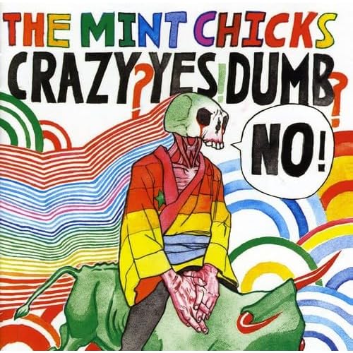 1. The Mint Chicks - Crazy? Yes! Dumb? No!
My opinion of the Mint Chicks has rollercoastered dramatically over the last couple of years. Initially stoked to hear a band playing the kind of music I wasn't expecting to hear from a NZ band with the Octagon Octagon Octagon EP, only to have them lose me with the F**K The Golden Youth album, and their somewhat arrogant standoffish attitude throughout this era (plus an unfortunate drunken run-in with Ruban Neilson after a gig at Indigo). I hadn't been looking forward to the new album much at all, outside vague curiosity. At least until I heard a crappy mp3 of You're Just as Confused as I Am. The punchy guitar riff, and poppy as hell vocal melody grabbed me and I had to hear more. I'd always preferred the more pop-driven side of the Mint Chicks as opposed to the spazzier artwank side of things, and this song hinted that perhaps they'd headed down the path I was hoping they would. In this day and age of every fucking album leaking weeks in advance, it was strange to have to wait for release day to actually hear an album. I went to Real Groovy the day it came out, picked it up and then cursed the fact that you can't just rub a CD against an ipod to transfer the songs.
On first listen the album seemed to be a non-stop sugar-rush (with some rather surprising almost nu-metal (in a good way... it's possible, they did it) riffs) for the first half and then peter out somewhat. Which isn't that far from the truth. The album definitely shifts gears 2/3 of the way through. But like all good albums, with time these songs became contenders. Kody's voice has always been really good and suited the music, but he's got some really good stuff going on here. Great memorable and infectiously catch melodies on a few tracks.
My band had the incredibly good fortune of playing with the Mint Chicks a few times this year, and it was really awesome to see and hear all these new songs played live. They've always been a strong live act, but things have really clicked into place. Highly recommend checking out their live show if you get the chance, and definitely check out this album. I could go on, but I'm hungry.
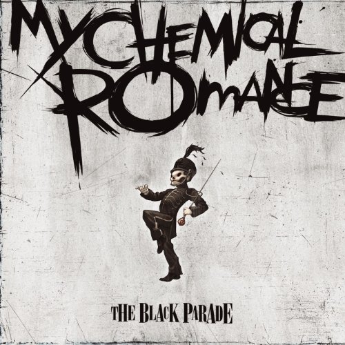
2. My Chemical Romance - The Black Parade
Believe me, I know okay! I've heard more than enough about how much they suck and emo's gay and blah blah blah. This is an incredibly solid rock record, with more than its fair share of overblown theatrics, but hell, it works for me. I started going off on a rant about how somewhere along the line no one noticed that all the cliches they're throwing around in the mainstream press as to what 'emo' is, is exactly the same as 95% of all goth cliches. IT'S THE SAME THING PEOPLE, just a few less ankhs and whiny, rather than mopey music.
Uh.. okay, so I guess that counts as a rant.. either way it annoys me and I don't see why anyone cares. Including me. Also, I'm not emo. Although in saying that it instantly means I am so I guess I am emo. Does that mean I'm not now?
Anyway, this album = good as.
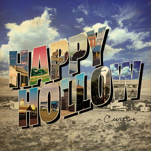
3. Cursive - Happy Hollow
"WHERE THE FUCK IS THE CELLO?!?! Horns? what?! *sob*" Initial reactions can be misleading. The Ugly Organ is definitely one of my top records of all time (that list in a future post), and a big part of what made that album so incredible was the addition of the cello. Happy Hollow ousts the cello and replaces it with a horn section. I'm a big fan of bands with horn sections (notably Rocket from the Crypt), but it just didn't seem like the right fit for Cursive. The dark atmosphere that the cello brought to Organ was all but absent on Hollow and I wasn't a happy man. Then I started to absorb the lyrics, and low and behold, a happy man I became.
4. Shaky Hands - Cut Off Your Hands EP
It wasn't much more than a year and a half ago (maybe less) that I saw Shaky Hands play Room 101 at Bodega to next to no one. Since then they've signed to a reputable indie label, toured Australia a bunch, toured with Steriogram and Deja Voodoo (okay, so crappy bands, but still, that's a big tour), and then one upping that by ending 2006 on a tour with Shihad and the Datsuns. All up I think I saw them play 6 times in 2006. FTS had the good fortune of playing with them too, towards the end of the year. Anyway, this EP rules. I managed to acquire it through nefarious means (aka soulseek) months before it was eventually released, but it's remained a mainstay in my playlist (this is more or less my main criteria for anything that's made it into this here list). Infectious basslines and vocals, sharp drumwork and hooky songs make a very tasty package indeed. If I had any gripe at all, it'd be that closing track Sorry has some kinda iffy lyrics. That, and the damn thing is too short and I want more more more!
5. .............
I'm kind of at a loss now... so here's a list of stuff I liked this year, but can't quite justify going in a 'BEST OF 2006' list.
TV on the Radio - Return to Cookie Mountain
The Blood Brothers - Young Machetes
Thursday - City by the Light Divided
Taking Back Sunday - Louder Now
the Matches - Decomposer
damn, even making this list is hard. There was definitely more than this, but I'm drawing a blank. Oh well.
I was gonna do a movies list, but I'm blanking out on that too. I'll have some dinner and maybe come back to it....
otherwise, that's all folks!
I never really write, much less give much thought to my favourite whatevers
Awesome stuff of the '06
1. Going to Melbourne to see Death Cab w/ Meg!
2. Fighting the Shakes playing This Night Creeps last ever show w/ the Mint Chicks (plus more or less everything else involved with the band... it all went far far better than I had ever anticipated)
4. Finally getting screenprinting gear, and beginning work on an exhibition with Meg
5. Managing to more or less support myself financially for another year.
Crap shits of 2006
1. The insane financial instability that comes with freelance contracting.
2. Feeling like I was gonna collapse and die in Melbourne after a hard night on illicit substances and no sleep.
4. Ummm... I dunno, last year was pretty sweet and nothing too awful is coming to mind. Hurrah!
Last year was a pretty odd one for albums. Tons of albums that I'd classify as "really good" came out, but not a lot of stuff that really wowed me and ended up going into constant circulation. I'm not even sure I can pick 5, but here goes:
1. The Mint Chicks - Crazy? Yes! Dumb? No!My opinion of the Mint Chicks has rollercoastered dramatically over the last couple of years. Initially stoked to hear a band playing the kind of music I wasn't expecting to hear from a NZ band with the Octagon Octagon Octagon EP, only to have them lose me with the F**K The Golden Youth album, and their somewhat arrogant standoffish attitude throughout this era (plus an unfortunate drunken run-in with Ruban Neilson after a gig at Indigo). I hadn't been looking forward to the new album much at all, outside vague curiosity. At least until I heard a crappy mp3 of You're Just as Confused as I Am. The punchy guitar riff, and poppy as hell vocal melody grabbed me and I had to hear more. I'd always preferred the more pop-driven side of the Mint Chicks as opposed to the spazzier artwank side of things, and this song hinted that perhaps they'd headed down the path I was hoping they would. In this day and age of every fucking album leaking weeks in advance, it was strange to have to wait for release day to actually hear an album. I went to Real Groovy the day it came out, picked it up and then cursed the fact that you can't just rub a CD against an ipod to transfer the songs.
On first listen the album seemed to be a non-stop sugar-rush (with some rather surprising almost nu-metal (in a good way... it's possible, they did it) riffs) for the first half and then peter out somewhat. Which isn't that far from the truth. The album definitely shifts gears 2/3 of the way through. But like all good albums, with time these songs became contenders. Kody's voice has always been really good and suited the music, but he's got some really good stuff going on here. Great memorable and infectiously catch melodies on a few tracks.
My band had the incredibly good fortune of playing with the Mint Chicks a few times this year, and it was really awesome to see and hear all these new songs played live. They've always been a strong live act, but things have really clicked into place. Highly recommend checking out their live show if you get the chance, and definitely check out this album. I could go on, but I'm hungry.
Believe me, I know okay! I've heard more than enough about how much they suck and emo's gay and blah blah blah. This is an incredibly solid rock record, with more than its fair share of overblown theatrics, but hell, it works for me. I started going off on a rant about how somewhere along the line no one noticed that all the cliches they're throwing around in the mainstream press as to what 'emo' is, is exactly the same as 95% of all goth cliches. IT'S THE SAME THING PEOPLE, just a few less ankhs and whiny, rather than mopey music.
Uh.. okay, so I guess that counts as a rant.. either way it annoys me and I don't see why anyone cares. Including me. Also, I'm not emo. Although in saying that it instantly means I am so I guess I am emo. Does that mean I'm not now?
Anyway, this album = good as.
"WHERE THE FUCK IS THE CELLO?!?! Horns? what?! *sob*" Initial reactions can be misleading. The Ugly Organ is definitely one of my top records of all time (that list in a future post), and a big part of what made that album so incredible was the addition of the cello. Happy Hollow ousts the cello and replaces it with a horn section. I'm a big fan of bands with horn sections (notably Rocket from the Crypt), but it just didn't seem like the right fit for Cursive. The dark atmosphere that the cello brought to Organ was all but absent on Hollow and I wasn't a happy man. Then I started to absorb the lyrics, and low and behold, a happy man I became.
4. Shaky Hands - Cut Off Your Hands EP
It wasn't much more than a year and a half ago (maybe less) that I saw Shaky Hands play Room 101 at Bodega to next to no one. Since then they've signed to a reputable indie label, toured Australia a bunch, toured with Steriogram and Deja Voodoo (okay, so crappy bands, but still, that's a big tour), and then one upping that by ending 2006 on a tour with Shihad and the Datsuns. All up I think I saw them play 6 times in 2006. FTS had the good fortune of playing with them too, towards the end of the year. Anyway, this EP rules. I managed to acquire it through nefarious means (aka soulseek) months before it was eventually released, but it's remained a mainstay in my playlist (this is more or less my main criteria for anything that's made it into this here list). Infectious basslines and vocals, sharp drumwork and hooky songs make a very tasty package indeed. If I had any gripe at all, it'd be that closing track Sorry has some kinda iffy lyrics. That, and the damn thing is too short and I want more more more!
5. .............
I'm kind of at a loss now... so here's a list of stuff I liked this year, but can't quite justify going in a 'BEST OF 2006' list.
TV on the Radio - Return to Cookie Mountain
The Blood Brothers - Young Machetes
Thursday - City by the Light Divided
Taking Back Sunday - Louder Now
the Matches - Decomposer
damn, even making this list is hard. There was definitely more than this, but I'm drawing a blank. Oh well.
I was gonna do a movies list, but I'm blanking out on that too. I'll have some dinner and maybe come back to it....
otherwise, that's all folks!
Subscribe to:
Posts (Atom)